


 LinkBack URL
 About LinkBacks
Example:
All has been done by watching this movie. Text instruction or any other things are not required.
You can add rep if you like it
no follow up
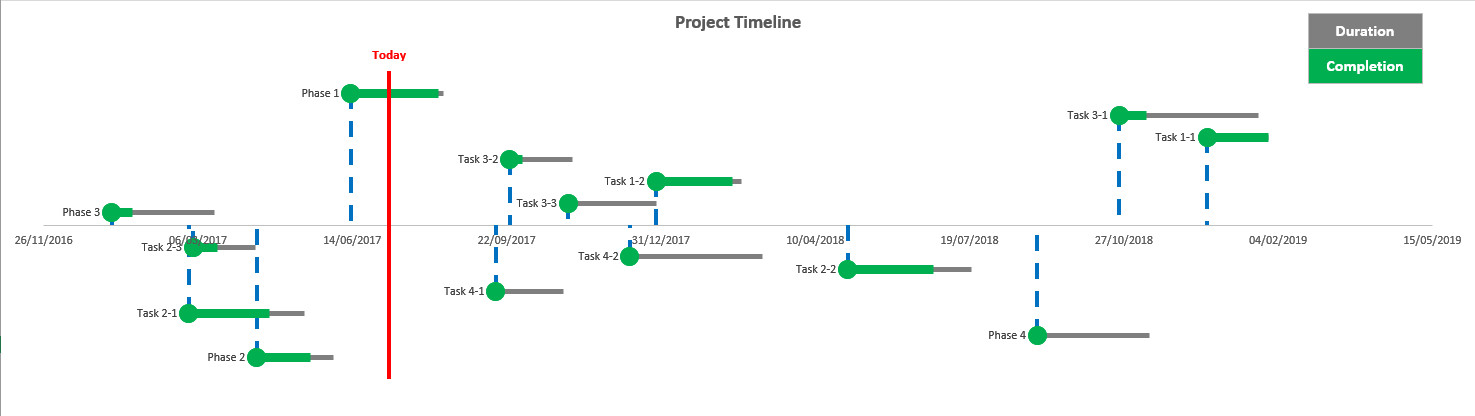
see attached file:


Example:
All has been done by watching this movie. Text instruction or any other things are not required.
You can add rep if you like it
no follow up
see attached file:
Last edited by sandy666; 07-09-2017 at 02:31 PM.
There are currently 1 users browsing this thread. (0 members and 1 guests)
 Posting Permissions

")

 Register To Reply
Bookmarks